project details
Duration: 8 weeks
My role: Sole product designer responsible for the UX/UI process, from initial research and persona development through final prototyping(independent project, not affiliated with OpenTable)
overview
In 2025, over half of Americans, especially Gen Z and Millennials, plan to eat out more, with experiential dining on the rise. High-demand reservations vanish quickly and can be hoarded or resold, leaving busy diners frustrated. Current systems and concierge services offer little real-time visibility into waitlists or last-minute openings.
Source: ¹ OpenTable. "2025 Hospitality Trends: What Diners and Restaurants Can Expect." https://www.opentable.com/restaurant-solutions/resources/hospitality-trends/
research methodology
My primary research focused on:
User interviews with 6 diners to understand how they currently book reservations at high-demand restaurants across platforms by identifying key pain points, frustrations, and unmet needs(if any) to uncover opportunities for a new OpenTable feature that improves convenience, transparency, and overall experience.
Competitive analysis of direct competitors (Resy, Tock) and an indirect competitor (Yelp), examining feature sets, booking workflows, waitlist management, and transparency mechanisms to identify market gaps and differentiation opportunities.
competitor analysis
Researching the restaurant reservation space and existing apps on the market
I explored existing reservation apps, trying them out myself and focusing on their ease of use and transparency of their booking features.
Strengths
OpenTable

The booking flow is clear and straightforward, making it easy to select date, time, and party size.
The layout is consistent and familiar, reducing the learning curve for returning users.
The platform offers a large inventory of restaurants, simplifying discovery.
Loyalty points are integrated into the interface, encouraging repeated use.
Resy

Modern, minimalistic design with smooth transitions.
Emphasis on exclusive/high-demand bookings.
Quick access to favorite restaurants and upcoming reservations.
Features like “Notify” improve engagement and flexibility.

Yelp

Directly integrated with Yelp reviews and discovery, making it easy for diners to browse restaurants.
The online waitlist feature provides transparency with real-time estimated wait times (in minutes) and remote join options.
Simple process for reservations.
Weaknesses
Resy
Can feel less intuitive for casual or first-time users, as discovering available tables, joining waitlists, or using features like “Notify” may require extra steps.
High-demand reservations can still be competitive, offering limited queue transparency once fully booked.
Tock
Heavy emphasis on “Experiences” can add friction for users wanting a simple, casual reservation.
May require more clicks/decisions up front, which can slow down the booking process.
Yelp
Reservation and waitlist features can feel secondary to Yelp’s main focus on reviews.
Limited inventory compared to OpenTable and Resy.
Interface feels less polished for managing high-demand or special-occasion bookings.
Uncovered opportunity: Waitlist transparency and predictive recommendations
OpenTable and its competitors offer no clear visibility into waitlist position or likelihood of securing a reservation. Resy, Tock, and Yelp all fall short here, offering only basic notifications with no predictive probability or intelligent alternatives. This revealed an opportunity to move beyond simple alerts and give diners the real-time, data-driven guidance they need to make confident booking decisions.
AFFINITY MAPPING

Finding 1: Fragmented booking across multiple channels
Diners navigate OpenTable, phone calls, and direct restaurant contact to secure reservations, but no single channel offers transparency into waitlist position or realistic odds of getting a table.
Finding 2: Existing waitlist features fall short on visibility
Diners are aware of the Notify Me and waitlist features, but neither provides enough information to make confident decisions about whether to keep waiting or look elsewhere.
Finding 3: High demand for visibility and control
Diners strongly value transparency in the reservation process, particularly knowing where they stand on waitlists and their realistic chances of securing a table. Without predictive information, they waste time monitoring reservations that may never materialize, leading to frustration and lost opportunities.
The problem
Diners need complete transparency about their reservation status, waitlist position, and realistic booking chances because uncertainty about securing tables for meaningful moments causes anxiety and forces them to seek confirmation through alternative channels.
The solution
Based on research insights, I designed a transparent alert feature that displays probability percentages upfront and provides AI-powered alternative suggestions, empowering users to make informed decisions before committing their time to a waitlist.
User flow
I mapped the end-to-end user flow to define key touchpoints, focusing on two core interactions: signing up for a Notify Me alert and accessing alternative restaurant suggestions. Both flows were designed to minimize friction and help diners stay informed without abandoning the process.

IDEATION
Making reservation uncertainty visible and actionable
Drawing from my research, I kept transparency at the center of every decision. Diners needed to know their chances of getting a table without having to guess or check multiple platforms. To address this, I surfaced a probability percentage directly in the alert flow, giving users a clear signal before committing to a waitlist. I also introduced alternative restaurant suggestions so diners always have a next step, even when their first choice isn't available.

Design System
Working within OpenTable's design system
Rather than building a new design system from scratch, this feature was designed to feel native to OpenTable's existing platform. I referenced OpenTable's established color palette, typography, and UI components to ensure visual consistency throughout my design, while introducing new feature elements such as the probability indicator.

high-fidelity wireframes
Screens designed to feel native to OpenTable

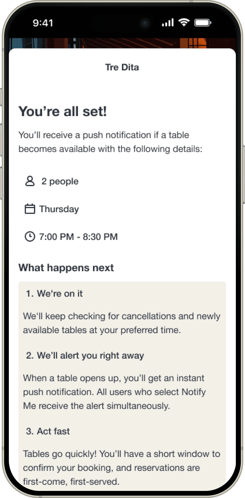
Working within OpenTable's existing design system, I built out three core screens: the restaurant detail page, the Notify Me flow, and the confirmation screen. Each screen was designed to integrate seamlessly with the platform, introducing new elements like the probability indicator without disrupting the familiar OpenTable experience.
usability testing
The usability test evaluated the mobile experience of OpenTable's Notify Me feature and AI-suggested alternatives for fully-booked restaurants. The study aimed to determine whether users can effectively understand and navigate the Notify Me flow, and whether placing it above AI suggestions reflects the right hierarchy.
The study was conducted through Maze with 13 participants who regularly dine at high-demand restaurants, have encountered fully-booked situations, and are familiar with OpenTable's notification and waitlist features.
tested flow: Health check-in
Happy path
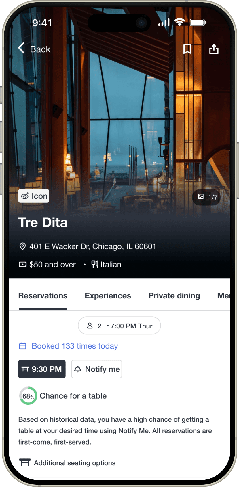
Probability indicator displayed with AI-suggested alternative restaurants
Edge case
Probability unavailable, with AI-suggested alternative restaurants
USABILITY TESTING key insights
Notify Me feature prioritization alignment
The Notify Me feature emerged as the strongly preferred option for participants who chose it over AI restaurant suggestions when their desired time slot was unavailable. This validates the current information hierarchy that positions Notify Me more prominently than AI suggestions
Clearer Notify Me context
Participants want clearer clarification on how Notify Me works. This will set proper expectations and potentially reduce support inquiries.
design iteration
Implemented clearer Notify Me context
Before
After
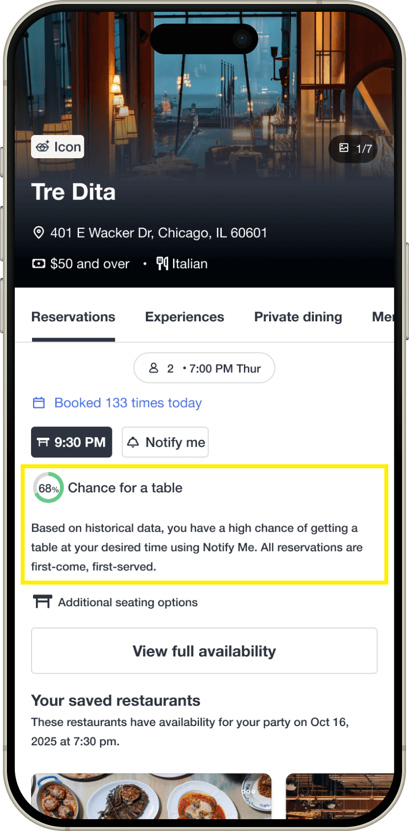
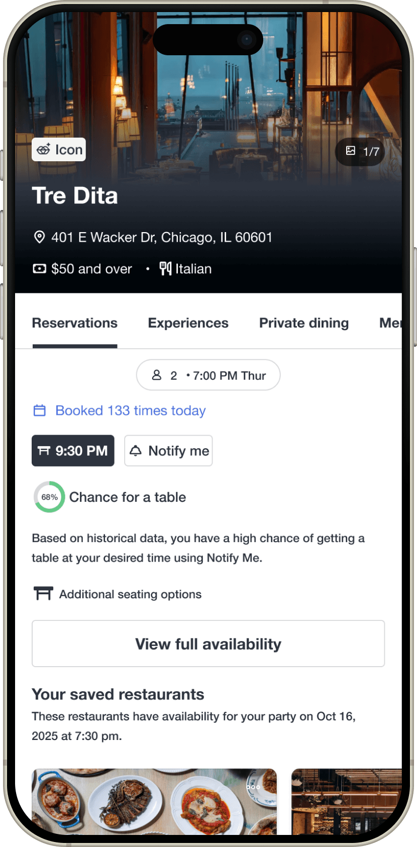
Using the impact-effort matrix, this high-impact, low-effort improvement was prioritized to add supporting text beneath the historical likelihood indicator, giving users clear guidance on how Notify Me works before signing up for an alert.
reflection
What I learned
Build in buffer time for technical testing issues
A Maze bug prevented several participants from completing Task Scenario 2, creating data gaps that complicated my analysis. I had to re-run the study with new participants while working with incomplete data and clearly documenting limitations. In future projects, I'd build buffer time into the timeline to account for unexpected technical issues and have backup testing methods ready from the start.
Seek alternative data sources
Not having access to actual OpenTable data meant I had to make research-informed assumptions rather than purely data-driven decisions. While I leveraged publicly available industry benchmarks, I would have benefited from conducting extensive primary research or reaching out to industry professionals earlier in the process to validate assumptions.