project details
Duration: 8 weeks
My role: Sole product designer responsible for the UX/UI process, from initial research and persona development through final prototyping
overview
Flyte Systems' website plays a critical role in early-stage decision-making, as prospects rely on it to quickly assess credibility and fit. Decision makers emphasize the importance of polished design, visible social proof, and clear guidance on pricing and next steps to support their evaluation process. Without these elements, potential customers may disengage before fully exploring the company's offerings.
research methodology
My primary research focused on:
Conducting user interviews with 6 potential clients across FlyteSystems' target industries using Maze to understand how they research and evaluate digital signage solutions online.
Performed a competitive analysis of direct (Aero Cloud, Sita, Simpleway, TSI, and FlightAware) and indirect competitors (22 Miles and airline mobile apps) to evaluate how they structure information, showcase services, and convert visitors to uncover opportunities for the website redesign.
competitor analysis
Mapping the digital signage landscape
I researched existing digital signage companies to evaluate how they structure their websites and present their solutions, identifying gaps and opportunities to inform the FlyteSystems redesign.
Strengths
Flyte Systems

The core value proposition is clear and differentiated.
The FAQs page signals that they understand prospects have questions before committing.
The whitepaper content shows some thought leadership effort.
Aerocloud

Modern, clean design with benefit-led copy and strong credibility signals from named airport logos and awards.
Multiple CTAs throughout the page keep conversion opportunities present.

22 Miles

They have a pricing page, industry-specific pages, and good use of customer quotes.
The resource library is robust with case studies, whitepapers, solution briefs, and a blog all support a buyer doing research before reaching out.
Weaknesses
Aerocloud
The volume of content may be overwhelming to users. In the homepage alone, there are multiple case studies, awards, airport logos, and solution breakdowns.
There's no clear hierarchy guiding a prospect toward a decision. Multiple CTAs are an asset, but without content prioritization they get lost in the noise.
Sita
The homepage hero rotates through five different banners with no clear primary message. A prospect landing on this site doesn't immediately know what SITA does or who it's for.
The nav has two separate entries for "Industries" and "Solutions" which creates redundancy and confusion.
The CTA "Talk to an industry expert" is buried at the bottom. No pricing signals anywhere,
22 Miles
Having both Industries and Solutions in the nav creates overlap and forces users to decide which path to take to find the same information.
The heavy push toward client work CTAs early in the page prioritizes social proof over helping a new prospect understand what the product actually does first.
Uncovered Opportunity:
Modernize the digital presence
A credible, modern design that signals the company is active and trustworthy is table stakes that FlyteSystems currently fails to meet, but would immediately set them apart from their own existing site.
Lead with pricing transparency
Transparent pricing communication is a gap across all competitors except 22Miles. FlyteSystems has an opportunity to stand out by offering clear pricing signals or at least a "request a quote" flow that sets expectations early.
Speak directly to each buyer
Industry-specific landing pages with tailored messaging would help prospects self-identify and feel spoken to directly, rather than navigating overlapping Solutions and Industries menus like every competitor currently has.
Let clients tell the story
Outcome-led case studies with named clients are only done well by AeroCloud. FlyteSystems can differentiate by pairing real client logos with specific, measurable results.
AFFINITY MAPPING

Finding 1: Discovery happens through search and social proof
Prospective clients begin their vendor search on Google, then validate options through online reviews, portfolio examples, and peer recommendations. Platforms like Yelp and AI tools supplement their research. Visual evidence of past work and third-party validation play critical roles in the shortlisting process.
Finding 2: Price and reputation drive final decisions
Cost is the primary selection factor, followed by portfolio quality and business ratings, signaling a need for transparent pricing and prominent display of successful projects to establish credibility.
Finding 3: First impressions build or break trust
Users look for testimonials, portfolio showcases, and clear pricing guidance. A modern, clean website directly impacts perceived legitimacy, while outdated or cluttered sites cause prospects to bounce before engaging.
The problem
Flyte Systems’ website lacks credibility signals and clarity, causing prospects to dismiss it early. Unclear pricing and next steps create friction, leading qualified leads to drop off before engaging.
The solution
Based on research insights, I redesigned Flyte Systems' website into a polished, credible website that leads with portfolio work, transparent pricing, and client testimonials to build immediate trust.
User flow
I mapped the end-to-end user flow, focusing on one core interaction: contacting the sales team. The flow traces a prospect's journey from the home page, accounting for decision points where users may find enough information to convert or may need to explore further before reaching out.

IDEATION
Redesigning trust from the first click
Drawing from my research, I kept credibility and clarity at the center of every decision. Prospects needed to understand what Flyte Systems offers and feel confident enough to reach out. I focused on creating a friendly experience that surfaces the right information at the right time and reducing friction in the conversion path.

Design System
Working within Flyte Systems' brand and visual language
Rather than reimagining the brand entirely, this redesign was grounded in FlyteSystems' existing visual identity. I referenced their established color palette and refined the logo to improve contrast and meet accessibility standards, while introducing a modernized layout, updated typography, and new UI patterns to elevate the overall experience and better serve their target buyers.

high-fidelity wireframes
A website designed to build trust and drive conversions
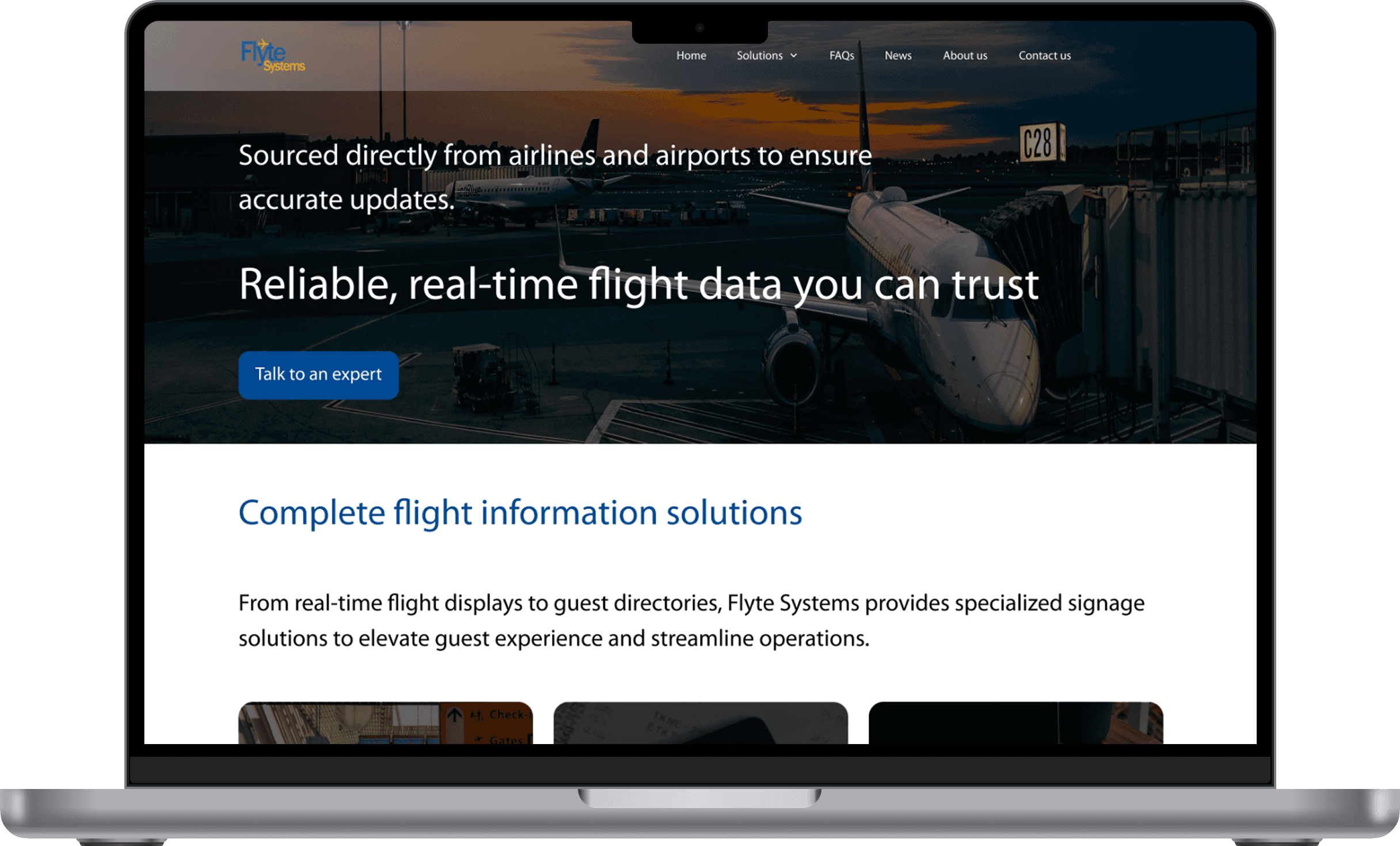


The high-fidelity designs focused on establishing credibility for a legacy brand, balancing a professional, enterprise feel with clear pathways to convert prospective clients into leads, surfacing credibility signals such as client testimonials, and making it easy to contact the sales team. While new photography would have elevated the visual experience, this redesign was completed by working entirely within Flyte Systems' existing asset library.
usability testing
Usability testing was conducted through Maze with 6 participants to evaluate how effectively users can navigate the FlyteSystems desktop website, understand their services, and complete key research tasks.
Participants included decision makers and contributors to the vendor selection process across targeted industries, people who recently evaluated digital signage providers without purchasing, and current users of competitor solutions.
tested flow: Health check-in
Industry solutions are prominently displayed on the main Home page, with dedicated industry pages for a list of offerings
Prominent Contact button throughout the website and an intuitive contact us form with clear required fields
USABILITY TESTING key insights
Intuitive basic navigation
Users found the fundamental website structure easy to navigate, noting that it was easy to locate the contact form and button.
Clearer pricing and response time clarification
The contact us page didn't explain how pricing works or provide clear response time expectations, causing visitor frustrations
design iteration
Clearer information on custom pricing, contact information, and response times
Before

After

Improved clarity by adding guidance on how to obtain pricing, highlighting response time expectations, and including business hours details. Visitors now have clear guidance on the pricing process and know what to expect when contacting the company.
reflection
What I learned
Designing with outdated assets
Flyte Systems’ outdated visuals required me to rely on layout and white space to create a clean, credible design despite limited imagery. While effective, I recognized that high-quality, updated photos would significantly improve trust and conversions. With more time, I would advocate earlier for investing in new visuals using a phased, impact-driven approach.
B2B research
I learned that in the B2B context, a website functions less as a browsing experience and more as a quick credibility filter during vendor shortlisting. This shifted my focus toward prioritizing signals such as testimonials, client logos, and clear positioning to help users make quick judgments. It also pushed me to be more intentional with research, designing questions that account for limited participant time while still uncovering decision-making drivers.